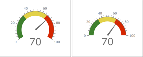
Gauges are used to display a single metric in a quantitative context defined by minimum and maximum values. The metric can be derived from one of a feature's numeric fields or from a summary statistic. These values can either be fixed or dynamic and can be based on feature values or summary statistics with or without applied filters. As with an indicator, a gauge shows the state of only one metric or value. Gauges are used to display current values rather than past or general trends.
Types of gauges
When configuring a gauge, you can choose from two styles: progress and meter. You can select the type of gauge to use on the Gauge tab of the element's configuration window. Depending on the type of gauge you choose, the available configuration options change.
Progress gauge
Progress gauges display where a value is in a quantitative context that is defined by minimum and maximum values. This value is visualized by a colored band and shown in the center of the gauge. You can choose to display the value as either a raw number or a percentage. Progress gauges can be displayed in one of three shapes: circle, horseshoe, or half circle.
When configuring your progress gauge's band, you can also choose to define thresholds by clicking +Threshold. You can use thresholds to change the color of the band as the value progresses.
In the following example, thresholds are defined so that the band appears red, yellow, or green, depending on the current value:
Meter gauge
Meter gauges have a quantitative context defined by minimum and maximum values. Meter gauges can be used to show the amount, level, or contents of something. The position of the meter gauge's needle indicates the current value rather than a band, and the value is displayed as a raw number in the center of the meter gauge. Meter gauges can be displayed as a horseshoe or half circle.
You can optionally choose to configure the value formatting, labels, the axis, and the needle.
When configuring a meter gauge, you can also choose to add guides by clicking +Guide. You can use guides to define interval ranges in terms of raw numbers or percentages. These ranges can be used to indicate a state such as good, average, or poor. You can also configure the gauge with a comparative measure, which facilitates comparisons to a predefined key performance indicator (KPI) or goal.
Actions
In an interactive dashboard, gauges can be the target of an action. This means that an action performed on another element, such as a selection on a list or a category selector, can control the data displayed on the gauge.