The Grid widget is a layout container that you can use to organize content in a grid. Grid widgets can contain multiple other widgets.
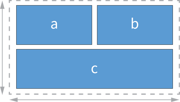
Examples
Use this widget to support app design requirements such as the following:
- You want page elements, such as embedded media, to be organized in a grid.
- You want users to be able to expand individual images in a grid to take up the full page.
Usage notes
When you add a Grid widget, the Add widget and Choose a grid template buttons appear. The latter button's window appears automatically. You can choose a grid template then add widgets to each grid item. To add widgets without a template, click the Add widget button and select from the widget gallery or drag in widgets from the Insert widget panel.
When you drag a new widget into the grid, the layout changes automatically depending on where you place the widget. If you place it in the center of an item that already contains a widget, it is added on a new tab.
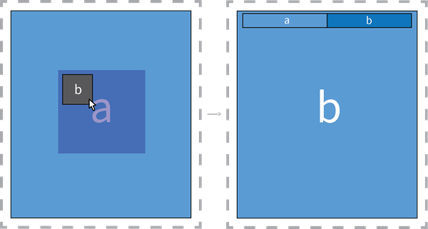
If you place a new widget anywhere else on top of an existing grid item, it is added as a new item and both items split the space taken up by the original item, creating either a grid column or grid row. You can hover over the gaps between items to drag and resize their boundaries. You can also click an item and use the Split horizontally or Split vertically buttons on the item's toolbar to divide an item in the same way.
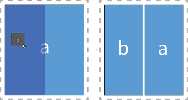
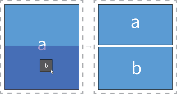
When you drag a new widget over a Grid widget that already contains multiple grid items, you can position the widget relative to the entire grid. Guide bars appear; you can use them to place a widget at the top, bottom, left, and right of the entire grid.
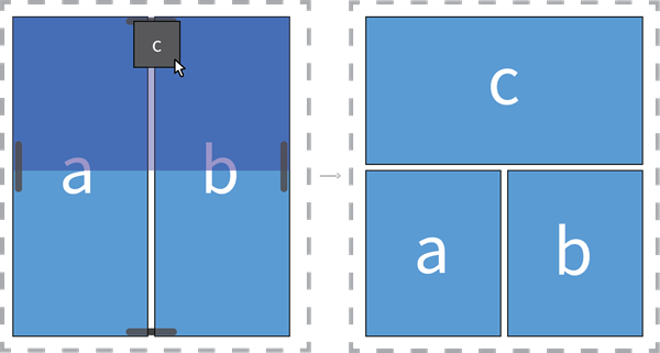
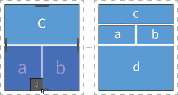
Some widgets, such as Card and Map widgets, allow you to nest other widgets inside of them. When you add one such widget, it enters a locked state by default. You can click the lock button to unlock the widget and reorganize any internal widgets. In the locked state, you can only change the widget's own settings. For example, if you include a Map widget containing a Draw widget in a grid, you must unlock the Map widget to move the Draw widget.
The Page panel's outline shows the hierarchy of widgets, tabs, grid columns, and grid rows contained in a Grid widget. Just like any widget, you can select any grid row or grid column in the outline and click the More button for a menu of operations. Grid rows and grid columns have the Distribute space horizontally and Distribute space vertically buttons, respectively. If a row or column makes up a tab, you can rename the row or column. Individual widgets contained in a Grid widget have the Split horizontally and Split vertically buttons in the More menu.
When you include the Grid widget in an app, the widget can provide users with the following interaction options (you must enable these options in the widget's settings):
- Click to expand individual grid items. The expand button
 appears when the user hovers over an item.
 - Drag the gaps separating each grid item to resize grid items.
Note:
In small-screen layouts, all widgets in a grid are automatically turned into grid tabs. However, you can create a custom layout to optimize a grid for different screen sizes.Settings
The Grid widget includes the following settings:
- Layout—Configure layout settings.
- Padding—Change the size of the padding spaces around the inner edge of the widget, either all at once or separately. You can specify the size values in pixels (px) or percent (%).
- Padding color—Change the color of the padding spaces around the inner edge of the widget.
- Gap—Change the color and width of the spaces between grid items. You can specify the width value in pixels (px).
- Grid items—Define how users can interact with grid items at run time.
- Allow resize—Allow users to drag the gaps to resize grid items.
- Allow expansion—Allow users to expand individual grid items.
Note:
You can override this setting in a widget's Style settings tab. This is useful if you want users to be able to expand some grid items but not others.