The Infographic widget provides 16 graphic templates you can use to visualize and monitor attributes and statistical data in the map and from extra data sources.
The visualization graph generated by the Infographic widget is dynamic, refreshing when the map extent or data source changes, and can be interactive with the map. The graphs also respond to the Filter and Select widgets directly, as well as the results from the Geoprocessing and Query widgets. The targets and corresponding indicators for the data are supported in certain templates.
Caution:
Be careful when you enable the Filter by extent option. If your app is shared publicly and might go viral, enabling this option will slow down the performance of the app dramatically due to the scaling of the server. It is strongly recommended that you use other widgets such as Filter and Group Filter to zoom to the features instead.
However, if this option is enabled automatically and can't be turned off, which means the statistic is calculated on the client side, your app would be fine.
The templates and their
values are listed in the following table:
Note:
With the exception of the first four templates listed in the table, the templates are called chart templates in this topic.
The percentage stacked chart (bar, column, and area) is an extension of the stacked chart and compares the percentage that each value contributes.
| Template name | Display value | Support custom indicators |
|---|---|---|
Number |
| Yes |
Gauge |
| Yes |
Vertical Gauge |
| Yes |
Horizontal Gauge |
| Yes |
Pie |
| No |
Donut |
| No |
Bar |
| No |
Stacked Bar |
*Although the mode is supported, the stacked effect may not be seen due to one data series. | No |
Percentage Stacked Bar |
*Although the mode is supported, the stacked effect may not be seen due to one data series. | No |
Column |
*Although the mode is supported, the stacked effect may not be seen due to one data series. | No |
Stacked Column |
*Although the mode is supported, the stacked effect may not be seen due to one data series. | No |
Percentage Stacked Column |
*Although the mode is supported, the stacked effect may not be seen due to one data series. | No |
Line |
| No |
Area |
*Although the mode is supported, the stacked effect may not be seen due to one data series. | No |
Stacked Area |
*Although the mode is supported, the stacked effect may not be seen due to one data series. | No |
Percentage Stacked Area |
*Although the mode is supported, the stacked effect may not be seen due to one data series. | No |
Add data source
The Infographic widget can visualize data from the map or the extra data sources. Before configuring the Infographic widget, decide which data source to use for the widget. It is intuitive to use the layers from the map as a direct data source. Consider the Extra data source option when you want complete control over the Filter by extent option on layers, or you want to visualize data outside the map.
Caution:
Be careful when you enable the Filter by extent option. If your app is shared publicly and might go viral, enabling this option will slow down the performance of the app dramatically due to the scaling of the server.Note:
When the map data source is used, the features on the map can be loaded by snapshot or on-demand mode. When features are loaded by on-demand mode, they are filtered by the current map extent. When features are loaded by snapshot mode, you can choose whether they're filtered by the current map extent. All the services use on-demand mode by default except the hosted feature service. For the point hosted feature, when the number of features is less than or equal to 4,000, snapshot mode is enabled; when greater than 4,000, on-demand mode is enabled. For the polyline and polygon hosted feature, the threshold is 2,000 features with 250,000 vertices. While the data is added from Extra data source, the features are loaded in a way that is similar to the snapshot mode.
The first step in configuring the Infographic widget is to choose the data source as follows:
- When Map is chosen as the data source, only feature layers with query capabilities are supported, and the refresh interval for layers activated in the map can be updated on the Map tab.
Caution:
If you want to keep the layers in sync with the latest data, setting the interval here does not take effect until the Refresh Interval option is activated for the layer in the map.
Note:
A feature layer is a single layer that can be created from a map service or feature service, from ArcGIS Online or ArcGIS Enterprise items, or from an array of client-side graphics. As a result, a feature layer can be added from the following sources:
- ArcGIS Server service URL from a feature service
- ArcGIS Server service URL from a sublayer of a map service
Caution:
The layer added from a map service as a group is available from the extra data source but not from the map data source.
- Hosted feature service
- Feature collection
- When Extra data source is chosen, you can add the Layer and Statistics types from the extra data source on the Attribute tab, or you can use the resultant output layer from other widgets in the app, such as Geoprocessing and Query. With each type, you have map, portal, and ArcGIS Server service options as well as complete control over Filter by extent. The Map option enables you to have more control over layers in the map; the latter two enable you to add data outside the map. In addition, when data is added as Layer, it can be a feature layer, a table, or an image service vector layer. When data is added as Statistics, it stores the feature count of group data (if specified) and performs server-side calculations on the sum, average, maximum, and minimum values of the group (if specified) based on one or more numeric fields.
Note:
The Infographic widget only considers the results of the Query and Geoprocessing widgets.
Tip:
As far as the Filter by extent option is concerned, you have the option to enable or disable it with data from Extra data source and data from the map data source when the features are loaded by snapshot mode. The Filter by extent option is always enabled when you choose data from the map data source and the features are loaded by on-demand mode.
When using the Infographic widget, you can use the related table as an external data source. When you do so, the related table is treated as a stand-alone table. There is no interaction between the table, related features, and the charts.
Configure the Number template
This widget can be set to open automatically when
an app starts. Hover over the widget and click the Do not open this widget when
the app starts button  to change the setting to Open this widget automatically when the app starts. (For widgets that you need to add to the app first, you can turn on this option after configuring the widget.)
The following steps describe how to configure a graph with the Number template. The settings of three gauge-related templates are similar to the Number template.
- Hover over the widget and click the Configure this widget button
 to open the configuration window.
Note:
If you need to add the widget to the app first, click a widget placeholder on the Widget tab. In the Choose Widget window that opens, select the widget and click OK.
- Click the thumbnail of the Number template and click OK.
- Choose the data source.
This can be a feature layer in the map, an output layer of the widget, or an extra data source added on the Attribute tab.
- Click OK and the settings panel of the template appears.
- Click the Change widget button to replace the default icon for this widget with an image of your own.
A file explorer window appears allowing you to browse to a local image file to use as the widget icon.
- Set interaction conditions if the data source is a feature layer from the current map:
- Use selection—Only use selected features to create the graph. If there is no selection in the source layer, the entire dataset will be used.
- Filter by extent—Only use features in the current map extent to create the graph.
- If the data source is a feature layer from the map and is loaded in on-demand mode, the Filter by extent option is checked and can't be turned off.
- If the data source is a feature layer from the map and is loaded in snapshot mode, the Filter by extent option can be turned on and off.
Note:
If a layer is added from the map section in Extra data source, the Filter by extent option can be turned on when you click the Set button under Filter in the Configure data source window and check the Only the features within the current map extent check box under Extent in the Data source filter window. However, once Filter by extent is on, it can't be turned off unless the Only the features within the current map extent check box is not checked.
- Modify an element's layout.
The left panel is not only a preview of the graph but also a flexible layout editor.
- The title, description, image, and number are elements that can be added to the template. Click an element thumbnail to hide or show the corresponding element.

- Select an element in the preview to highlight it, and drag the upper and lower borders to resize it. Drag the handle in the upper right corner to rearrange it.
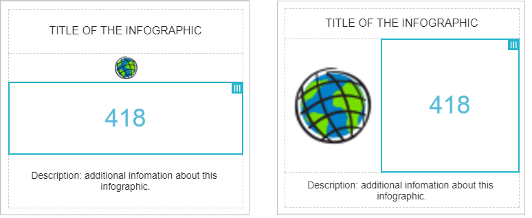
- Click the Reset button
 to reset the layouts.
 - Click Change Template to choose a different template, such as Gauge.
Caution:
Changing templates will delete the existing settings and open a new, blank template.
- The title, description, image, and number are elements that can be added to the template. Click an element thumbnail to hide or show the corresponding element.
- Click each element to set its parameters.
All changes take effect in the preview synchronously.
- Text settings—Set the text, font, text size, text color, alignment, and link for the text. Optionally customize the background color of the element.
- Image settings—Set the image source, alignment, and link. Optionally customize the background color of the element.
- Number settings—Set the options on the Data, Display, and Indicators tabs.
- Data—Set the data format of the result number to either Feature count or Field statistics.
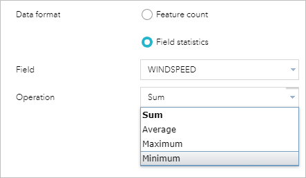
Note:
The Gauge template supports set minimum and maximum values. If you need to set these values based on dynamic statistical data, you should first have statistic based data defined in the Extra data source. - Display—Set the number’s unit, decimal places, prefix, and suffix. You can also customize the common text parameters (font, text size, text color, and alignment) and background color of the element.
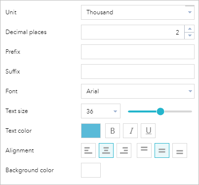
Tip:
The value displayed in the Gauge template can be the number of a feature count or field statistic as well as the proportion of that number in the provided data range. You can customize the gauge's bar's background and front color in the Display section.
- Indicators—Set the target values and corresponding indicators. There are two optional indicators: the color of the value and the indicator icon. If the target value meets the conditions, the element’s color and icon, if set, change accordingly.
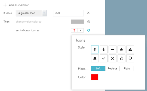
Caution:
The indicators are executed in top-down order. The final appearance is determined by the last condition that the data meets.
Tip:
The Gauge template also supports ratio targets. This means the target is the percentage given the data range.
- Data—Set the data format of the result number to either Feature count or Field statistics.
- Click OK to finish the configuration.
Configure the Column template
Compared to the Chart widget, the chart templates are enhanced with the following features:
- Use the layer's symbol color as the chart color when applicable.
Note:
The Use layer's symbol option is on the Display tab. Whether the option is available depends on the type of layer renderer in the map and the display mode you choose on the Data tab. For example, when the layer is rendered by unique values without a symbol, and Display values feature by feature is chosen, you have the option to use the layer's symbol color as the chart color.
- Predefine custom colors for value fields when applicable.
- When the date field is chosen as Category field in display mode, parse the minimum period into one of selected units, including year, quarter, month, day, hour, minute, and second.
- Sort the chart by the value or label.
- Set the maximum categories for performance.
- Set the text size for both horizontal and vertical axes.
- Turn on the option to display integer scale only.
- Use the extra data source.
- Set a modern look and feel.
- Click the thumbnail of the Column template and click OK.
- Repeat steps 3 through 7 in the Configure the Number template section.
- Click each element to set its parameters.
All changes take effect in the preview synchronously.
- Text settings—Set the text, font, text size, text color, alignment, and link for the text. Optionally customize the background color of the element.
- Chart settings—Click the Data tab. Set a display mode and associated parameters. Generally, there are four display modes, as follows:
- Display values feature by feature—Display values of one or multiple fields for each feature in the layer and display values feature by feature. For example, in a cities layer, you may want to display the population for each city as a bar or column. You may also want to display the male and female population as clustered bars and columns per city.
- Display values by category—Display statistical values of one or multiple fields for each category of features in the layer. For example, in a cities layer, if you specify the state field as the category, you can display the total population for cities per state.
- Display feature counts by category—Display total feature counts for each category of features in the layer. For example, in a cities layer, you can specify the population class field as the category, and calculate the counts of cities in each population class.
- Display attribute values as charts—Display the statistical value for a specified field or fields in the layer. For example, in a cities layer, you can display the total population as a bar for all cities in the year 2000, and the other bar for a total population of all cities in the year 2010.
Note:
Choose more than one value field for stacked charts.
- Display tab—Set display parameters. Optionally change the default display range to show all results in the chart. Users can still adjust the display range to show a subset of results by moving a slider in the widget. You can set the chart color to use a layer's symbol color or custom colors defined for selected value fields and include a legend. You can also set the title and label and configure a range of values for the horizontal and vertical axes.
- Marks tab—You can add line or area marks to your chart. These marks can visually present specific criteria for the chart.
- Click OK to finish the configuration.
Use the Infographic widget
Open the Infographic widget in the app by clicking the widget icon.
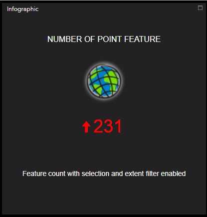
Keep the following in mind when you use the widget:
- If the Use selection option was checked during configuration, the number changes when features from the source layer are selected.
- If the Filter by extent option was checked during configuration, the number changes when the map is panned or zoomed.
- If indicators were set during configuration, the color and icon change with the number.
- The graph is updated when the data is refreshed.
You can also do the following with the chart templates:
- Hover over individual pieces in the chart. The category and field values display, and the corresponding feature is highlighted on the map.
- Move the slider or drag its ends to adjust the display range so the chart shows all or a subset of records.
- Click the Settings button
 to turn the legend, data labels, and axis on or off.