After an element has been added to a dashboard's view, it must be configured. When you add an element to your dashboard, the configuration window for that element opens. You can also open an element's configuration in the View pane by clicking the Options button  next to the element and clicking Configure, or by hovering over the element on the dashboard and clicking the Configure button
  .
.
Note:
Configuring an element, including duplicating, renaming and deleting it, only applies to the active view. Elements copied from the desktop view to the mobile view have the option of updating to reflect any configurations made to the original desktop view element.The configuration window of each element includes a series of tabs that include options that correspond to a particular aspect of configuring that element. The exact configuration details for each element differ. This topic includes general configuration information. For configuration details specific to an element, see that element's topic in the help.
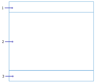
To understand the settings on the various tabs, think of the element as having three distinct areas: a title area, an area for the visualization, and a description area, which are labeled 1, 2, and 3, respectively, in the following image. The title and description areas are configured on the General tab. The visualization area is based on settings configured on the Data tab (if applicable) and any other element-specific tabs you see.
General settings
In many cases, the general settings for an element appear on the General tab. The most common general settings are described below:
- Name—When a new element is added to a view, it is assigned a name. If your dashboard is a static representation of data, you can leave the default name. However, if your dashboard's goal is to provide a more interactive experience, assigning an easy-to-interpret name makes configuring dashboard actions easier.
- Title—An area at the top of the element to place a title or other useful information. This information is configured as rich text. See Use HTML for more information. If a title is not specified, this area can be occupied by the data visualization. Titles larger than 30 percent of an element's height cause scroll bars to appear. If you need to add a lot of text, consider using a rich text element and grouping it to the element being configured instead.
- Description—An area at the bottom of the element to place useful information. This information is configured as rich text. See Use HTML for details. If a description is not specified, this area can be occupied by the data visualization. Descriptions larger than 30 percent of an element's height cause scroll bars to appear. If you need to add a lot of text, consider using a rich text element and grouping it to the element being configured instead.
- Last update text—Displays the last time the element's layer was refreshed. When enabled, it appears in the lower corner of the element's description area.
- Data download—For data-driven elements, allow users to download the data that is powering the element.
- No data—For data-driven elements, choose to configure a label that displays when there is no data to render on the element. By default, an element in this state displays the label No Data.
- No selection—When elements are configured to render only when a selection is made using the Render only when filtered option, choose to configure how the element displays before rendering. By default, an element in this state displays the label Selection required on one or more elements.
Data settings
Most dashboard elements are data driven and require that you select their data source as the first step of configuring them. In the case of the map element, you are prompted to select a web map or web scene. In the case of other elements, such as indicator, gauge, list, and details, you are prompted to select a layer or data expression.
Tip:
If you have previously added other elements to the dashboard, their data sources appear as options you can select when adding new elements. For example, if you have previously added a map element, its operational layers appear as potential data sources when adding other elements.
When configuring a data-driven element, a Data tab is available. On this tab, you can change the data source, and apply filters. For some element types, there are also element-specific data settings. For example, both the indicator and gauge elements have a Value conversion setting that is used to convert values from one unit of measure to another at run time.
As you configure your element, you can preview your visualization in the preview area. For data-driven elements, you can click Data table in the preview area to expand the attribute table for your data source.
Accessibility settings
Each element includes an Accessibility tab in its configuration window. On the tab, you can set the Accessible name property for your element. The name you enter defines what is read by screen readers. The name entered should be similar to the title of the element.